I have a following custom view that have 2 text fields and a RadioButton, I'd like it to behave like a RadioButton (when it comes to talkback)
Currently: When selecting the customRadioButton it says
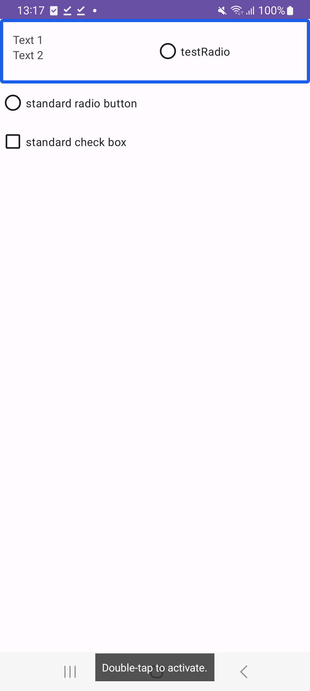
Text 1, Text2 double tap to activate
So it doesn't announce the state (selected/not selected) or the type of the component. When I navigate to radio button view in this custom view it is announced correctly: not selected, testRadio, Radio button
Desired behaviour: It should say (same structure as by RadioButton)and treat the whole view as one element.
Not selected, Text1, Text2, Radio Button, double tap to toggle.
How to achieve such result? Also I'd like to be able switch between RadioButton OR Checkbox behaviour for this custom element.
custom_radio_button_with_text:
<androidx.constraintlayout.widget.ConstraintLayout xmlns:android="http://schemas.android.com/apk/res/android"
    android:layout_width="match_parent"
    android:layout_height="wrap_content"
    android:padding="16dp"
    xmlns:app="http://schemas.android.com/apk/res-auto">

    <LinearLayout
        android:id="@+id/textStack"
        android:layout_width="0dp"
        android:layout_height="match_parent"
        app:layout_constraintStart_toStartOf="parent"
        app:layout_constraintTop_toTopOf="parent"
        app:layout_constraintEnd_toStartOf="@+id/radio_button"
        android:orientation="vertical">
        <TextView
            android:id="@+id/text1"
            android:layout_width="wrap_content"
            android:layout_height="wrap_content"
            android:text="Text 1"
            app:layout_constraintStart_toStartOf="parent"
            app:layout_constraintTop_toBottomOf="@id/radio_button"
            app:layout_constraintBottom_toTopOf="@id/text2"
            />

        <TextView
            android:id="@+id/text2"
            android:layout_width="wrap_content"
            android:layout_height="wrap_content"
            android:text="Text 2"
            app:layout_constraintStart_toStartOf="parent"
            app:layout_constraintTop_toBottomOf="@id/text1"
            />
    </LinearLayout>

    <RadioButton
        android:id="@+id/radio_button"
        android:text="testRadio"
        android:layout_width="0dp"
        android:layout_height="wrap_content"
        app:layout_constraintStart_toEndOf="@id/textStack"
        app:layout_constraintEnd_toEndOf="parent"
        app:layout_constraintTop_toTopOf="parent" />


</androidx.constraintlayout.widget.ConstraintLayout>
CustomRadioButtonWithText file:
class CustomRadioButtonWithText(context: Context, attrs: AttributeSet) : ConstraintLayout(context,attrs), Checkable{

    private var isChecked = false
    private val radioButton: RadioButton
    private val textView1: TextView
    private val textView2: TextView

    init {
        LayoutInflater.from(context).inflate(R.layout.custom_radio_button_with_text, this, true)

        radioButton = findViewById(R.id.radio_button)
        textView1 = findViewById(R.id.text1)
        textView2 = findViewById(R.id.text2)

        setOnClickListener {
            toggle()
        }
    }

    override fun setChecked(checked: Boolean) {
        isChecked = checked
        radioButton.isChecked = isChecked
    }

    override fun isChecked(): Boolean {
        return isChecked
    }

    override fun toggle() {
        isChecked = !isChecked
        radioButton.isChecked = isChecked
    }
}
And it is used in a following activity_main.xml
<androidx.constraintlayout.widget.ConstraintLayout xmlns:android="http://schemas.android.com/apk/res/android"
    xmlns:app="http://schemas.android.com/apk/res-auto"
    xmlns:tools="http://schemas.android.com/tools"
    android:layout_width="match_parent"
    android:layout_height="match_parent"
    tools:context=".MainActivity">

    <com.example.myapplication.CustomRadioButtonWithText
        android:id="@+id/customRadioButtonWithText"

        android:layout_height="wrap_content"
        android:layout_width="match_parent"
        app:layout_constraintEnd_toEndOf="parent"
        app:layout_constraintStart_toStartOf="parent"
        app:layout_constraintTop_toTopOf="parent">
    </com.example.myapplication.CustomRadioButtonWithText>

            <androidx.appcompat.widget.AppCompatRadioButton
                android:text="standard radio button"
                android:id="@+id/standardRadioButton"
                android:layout_width="wrap_content"
                android:layout_height="wrap_content"
                android:visibility="visible"
                app:layout_constraintStart_toStartOf="parent"
                app:layout_constraintTop_toBottomOf="@id/customRadioButtonWithText"
                />

            <androidx.appcompat.widget.AppCompatCheckBox
                android:text="standard check box"
                android:id="@+id/standardCheckBox"
                android:layout_width="wrap_content"
                android:layout_height="wrap_content"
                android:visibility="visible"
                app:layout_constraintStart_toStartOf="parent"
                app:layout_constraintTop_toBottomOf="@id/standardRadioButton"
                />

</androidx.constraintlayout.widget.ConstraintLayout>

Seeing as how your
CustomRadioButtonWithTextdoesn't extend fromRadioButton, I can't think of a way to make accessibility behave as if it's aRadioButton, I'd suggest using the function announceForAccessibility on the RadioButton instance you have in your custom view.