I am using Tamagui Input component and I want to add icons to it.
I am having to use a combination of <Stacks /> to horizonally align buttons (with icons) with my Input component like so:
const SearchBar = () => {
  return (
    <XStack alignItems="center">
      <Button
        size="$4"
        icon={<Search />}
        marginRight="$-4"
        borderTopLeftRadius="$4"
        borderBottomLeftRadius='$4'
        borderTopRightRadius="$0"
        borderBottomRightRadius="$0"
        borderColor="$gray12Light"
        backgroundColor='$gray5Light'
        borderWidth="$0"
        borderRightWidth="$0"
      />
      <Input
        placeholder='Searchword'
        flex={1}
        borderColor="$gray12Light"
        focusStyle={{
          borderColor: '$gray12Light'
        }}
        borderWidth="$0"
        value={value}
        backgroundColor='$gray5Light'
        borderBottomLeftRadius='$4'
      />
      <Button
        size="$4"
        icon={<X/>}
        display={value?.length ? 'flex' : 'none'}
        onPress={() => handleClear()}
        marginLeft="$-4"
        borderTopRightRadius="$4"
        borderBottomRightRadius='$4'
        borderTopLeftRadius="$0"
        borderBottomLeftRadius="$0"
        borderColor="$gray12Light"
        backgroundColor='$gray5Light'
        borderWidth="$0"
        borderLeftWidth="$0"
      />
    </XStack>
  )
}
You'll notice I am wrapping my <Search /> icon and <X /> icon in a Button component. It seems to be the only way to align the icons and be able to set the background color.
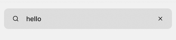
This creates an input with a left aligned icon and a right aligned icon like so:
Does Tamagui provide any props that I can pass icons into my Inputs? Maybe other people have a better solution that what I have? Open to suggestions on how's best to handle this as my current implementation seems very convoluted.
I tried using a <Stack/> but it wouldn't allow me to override the colors. But I feel like it's still the same issue that it's a convoluted layout for handling icons on an input.
This is the code using Stack instead of Button:
<XStack alignItems="center">
  <Stack
    marginRight="$-4"
    borderTopLeftRadius="$4"
    borderBottomLeftRadius='$4'
    borderTopRightRadius="$0"
    borderBottomRightRadius="$0"
    borderColor="$gray12Light"
    backgroundColor='$gray5Light'
    borderWidth="$0"
    borderRightWidth="$0"
  >
    <Search />
  </Stack>
  <Input
    placeholder='Searchword'
    flex={1}
    borderColor="$gray12Light"
    focusStyle={{
      borderColor: '$gray12Light'
    }}
    borderWidth="$0"
    value={value}
    backgroundColor='$gray5Light'
    borderBottomLeftRadius='$4'
  />
  ...
This is what it results in: