I am trying to make an Oscillatory animation using css as shown below:
Here's how I have created my animation:
@keyframes rotateFeather {
    0% {
        transform: rotate(0deg);
    }
    25% {
        transform: rotate(-180deg);
    }
    50% {
        transform: rotate(-90deg);
    }
    75% {
        transform: rotate(90deg);
    }
    100% {
        transform: rotate(180deg);
    }
}
Here is my class: (Using sccs)
.logo {
    height: 5rem;
    transition: all 0.3s ease;

    &box {
        position: absolute;
        top: 4rem;
        left: 4rem;
    }

    &:hover {
        animation-name: rotateFeather;
        animation-duration: 1s;
        animation-iteration-count: infinite;
        animation-timing-function: linear;
    }
}
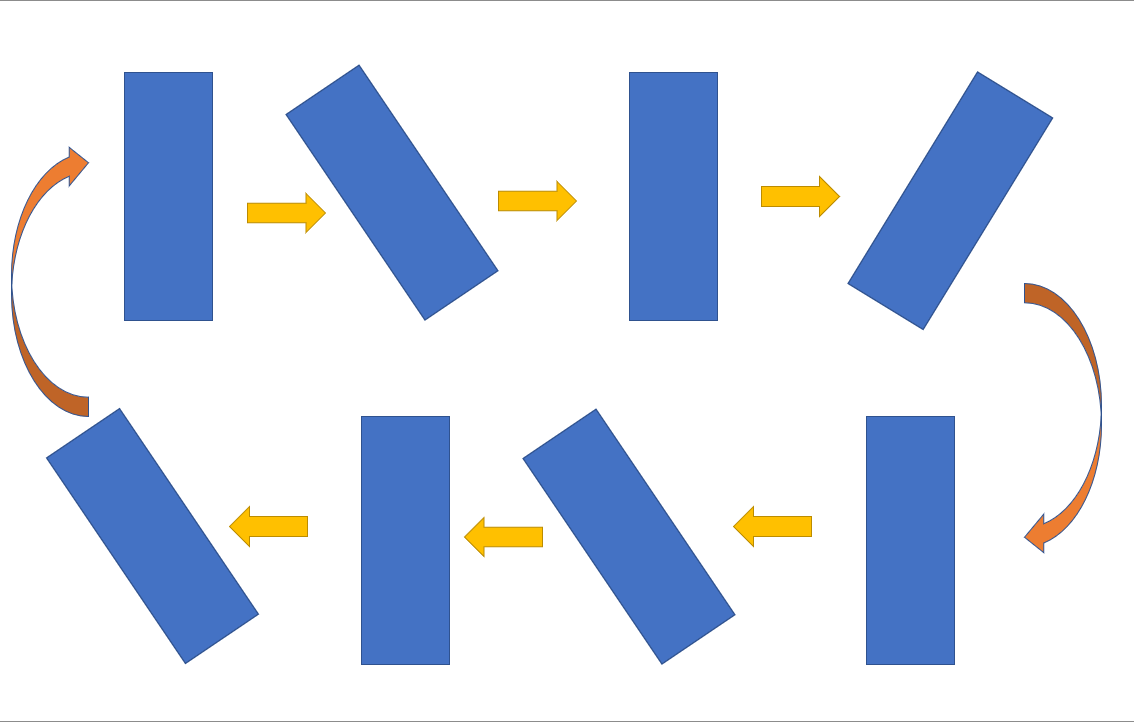
Here I am facing this problem: When it reaches 180deg at 100% it abruptly resets to 0 which I want to make smooth.
How is it possible to do the same?

To ensure smooth transition, We need to make sure that transformation at 0 and 100% must match with the original state:
This helped me to solve my issue. I am not sure, if I need to add
transform-originin every stage, if someone can elaborate better on that, that would be helpful.