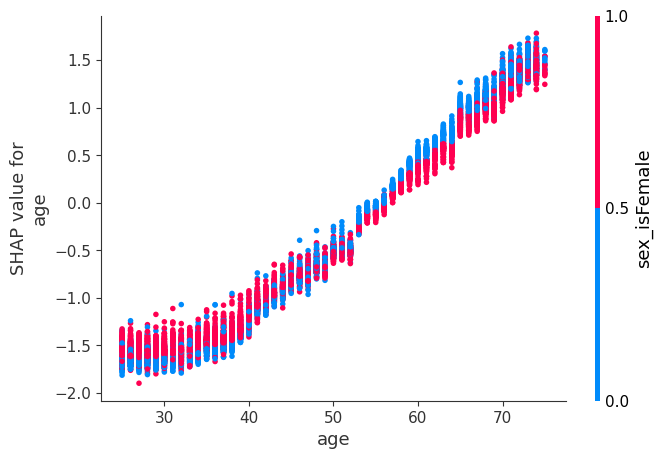
I've noticed from my own work and work with SHAP values all over the web that there is an odd "flip" in the relationship between the x-axis feature and the interaction feature in dependence plots where the x-axis feature tends to have a positive relationship with SHAP value. Every time I ask someone about this they look into the specifics of my data or the data I show them so let me provide a bunch of examples to show everyone that this is widespread across all types of subjects and datasets.
In all of these charts you will see that, the coloration pattern flips around zero on the y-axis (SHAP values for a given feature).
Here is an example from SHAP readthedocs showing the increasing chances of death with age and the interaction of Systolic Blood Pressure:
Here is one of alcohol percentage (feature) vs red wine quality (target) with sulphates as the interaction variable: Diamond carat vs diamond value with clarity as interaction:
The last example is from my own work, so I'll refer to that specifically. The chart shows that SHAP values - in this case the addition to or subtraction from the mean home value in dollars - in good neighborhoods are higher for large homes and lower for small homes. That makes sense. But for worse or poorer neighborhoods, the chart shows that large homes take away more value than small homes. In other words, in worse neighborhoods small houses cost more than large houses. This obviously doesn't make sense as home size is the primary determinant of price in most real estate markets (including this one according to various feature importance measures including mean abs SHAP values).
So why does this happen? Why does the first linked chart show that for older people, lower blood pressure increases the chance of death more than higher blood pressure? Why does the diamond dataset example show that for lower carat diamonds, lower clarity seems to be more valuable than higher clarity? TIA!
there is code on kaggle, readthedocs, etc. so I won't add any.