On website I saw next picture:
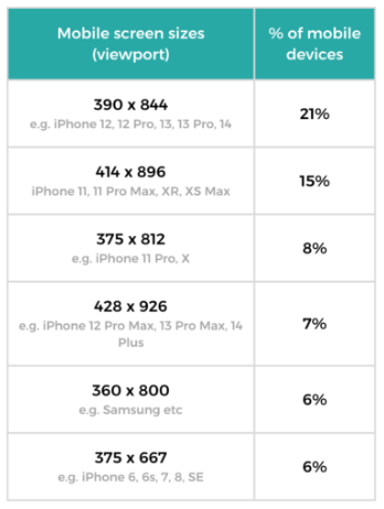
How to understand for example screen size 390 x 844 on IPhone 12, while IPhone 12 screen resolution is 2532 x 1170, why here is it 390 x 844?
Website - mobile-screen-sizes
On website I saw next picture:
How to understand for example screen size 390 x 844 on IPhone 12, while IPhone 12 screen resolution is 2532 x 1170, why here is it 390 x 844?
Website - mobile-screen-sizes
 On
On
The screen resolution is a different thing than screen size, screen size is more about a ratio while screen resolution define the number of pixels. Screen size is mainly used to understand the ratio between the lenght and the width of the device.
For example the screen resolution of the iphone 12 is 3 times the screen size here. While for the case of the iphone 11, the screen resolution is 2 times the screen size.
In order for a web page to be readable on a smartphone, an adaptive setting for the visible area (
Viewport) was invented. For example, theiPhone 12has a resolution of1170 x 2532and a pixel density of460 ppi. If a website is displayed in such a resolution, the text on the smartphone screen will simply be too small to read due to the low pixel value relative to the smartphone screen. Because of this, the smartphone screen resolution is artificially reduced, and the website is displayed as if it were on a smartphone with a lower screen resolution.The formula to calculate how much the display will be reduced is as follows: If the screen has a pixel density of less than
200 ppi, the resolution will be equal to the physical resolution. If the screen has a pixel density of200 ppito300 ppi, the new resolution will be1.5times less than the physical resolution. And if the screen has a pixel density of more than300 ppi, the new resolution will be determined by dividing the physical resolution by a certain coefficient. This coefficient is determined by the formula -Pixel Density / 150 ppi, usually rounded to 2, 2.5, 3, 3.5, 4, etc.For example:
iPhone 12- actual resolution1170 x 2532 px, pixel density460 ppi. We can see that the pixel density per inch of theiPhone 12(460 ppi) is greater than300 ppi, so we calculate the coefficient manually:460 ppi / 150 ppi = 3 (rounded to 3). Now, using this coefficient, we calculate the artificial resolution of theiPhone 12, or in other words, the resolution of ourviewport:1170 px / 3 = 390 px,2532 / 3 = 844 px. Now, effectively, with a resolution of1170 x 2532 px, a web page will be displayed as if the smartphone's resolution were390 x 844 px.The next image demonstrates the same concept, but for the

iPhone 4:The information and materials are taken from the website - https://itchief.ru/html-and-css/viewport-meta-tag.